
IntroductionA chart is used to help interpret a mass of data, to determine trends or changes in proportions. You can add a multitude of elements (text, pictures, images, etc.) to your chart. However, remember to add only items that will help people understand the main point of the chart. Never add anything that might distract from it. The double click is back!An option that was very handy in Excel 2003 is now back in Excel 2010 and 2013.The possibility to double-click on any of item of the chart in order to change its format was removed in Excel 2007. In that version, you must place the cursor on the item, press on the right mouse button and choose "Format ...". However, it may be difficult to select an item when several are close to each other. That is why the first option in the Layout and Format tabs is the list of elements that make up the chart. The next step is to create a chart in order to see the options offered by Microsoft Excel.
There is also the stock charts that will show the highest, lowest and close values for a particular stock that you follow. The surface charts will show peaks and valleys from all the data.
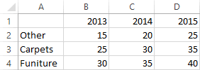
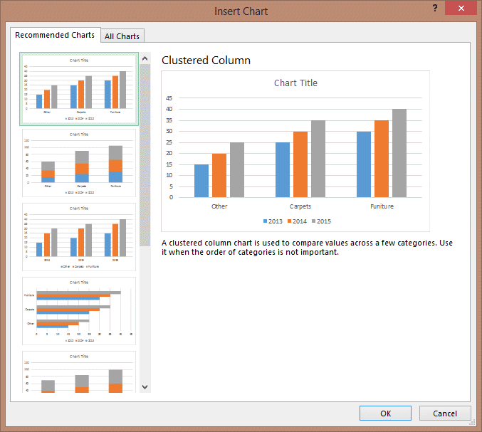
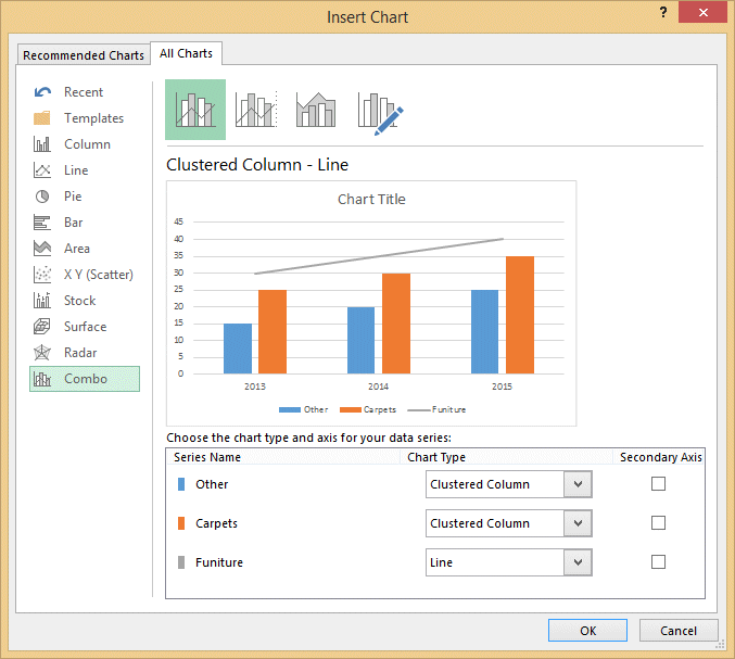
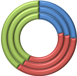
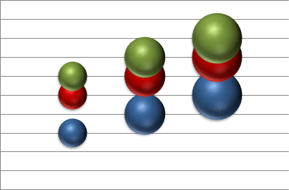
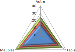
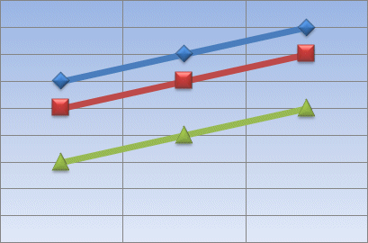
The three charts above representents the same values. Which one best represent the values? Would another chart type be more appropriate ? The only person that can answer this question is you. Try out different types of charts before selecting the one that best suit your needs. Remember, a chart is used to make it easier for the reader to interpret the data; not harder. Any item you place on your chart must meet that goal.
Change the chartWith Office 2007, Microsoft changed completly the menu structure; including the way to manage charts. All the options are now under three tabs : Design, Layout and Format. Excel 2013 takes it one step further. The options that were under the layout tab have been moved to the right side of the chart. Some other fun options were also added. |
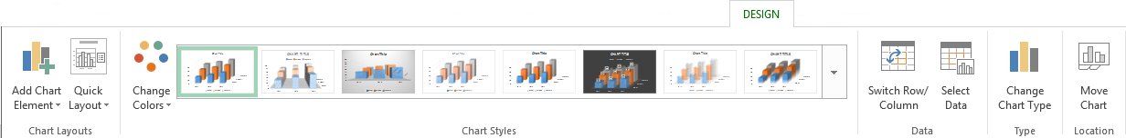
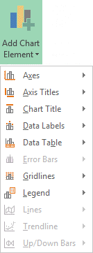
This next section will explain the options found under the chart tabs. The Design tabThe Design tab allows you to determine the chart type, the data source for these charts, the chart styles and its location in the workbook. The order of the options were changed in Excel 2013. But, most options are also available in Excel 2007 and 2010. Add Chart element
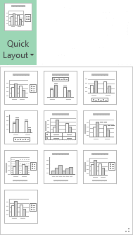
Quick layout
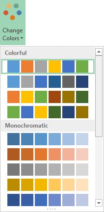
Change colors
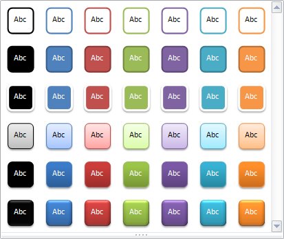
Chart Styles
The chart styles gallery helps you change how the data is presented. You can choose from styles in the list or personnalize even more with the options under the chart's Format tab. Switch Row/ColumnExcel you offers an easy way to reverse a chart. The values that where on X axis are now on the Y axis and vice versa. You can decide which version best represent your data. |

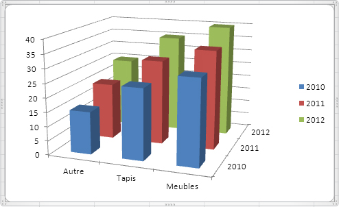
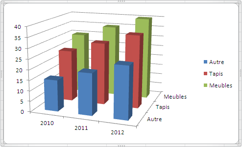
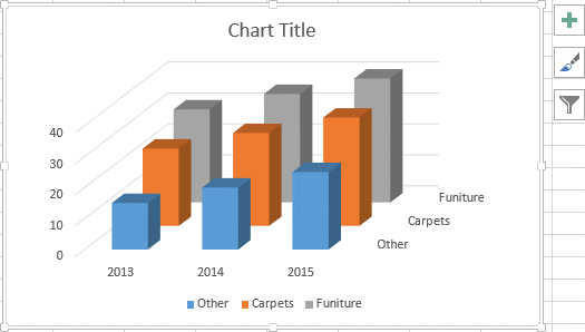
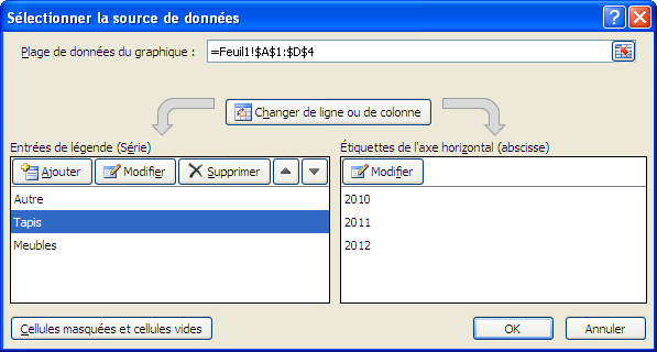
Look at the two charts above. Both are 3-D Column charts. However, the data for the X and Y axes have been reversed. The first chart represents the types of products by year. The second chart shows the years and the values by type of product. Select dataThis option allows you to add, edit or remove the data series from the chart.
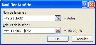
The Switch Row/Column option is the same as mentioned above. The other buttons allows you to add, change or remove of data series. The up and down arrow buttons allow you to change the presentation order of the data series. This is very useful when a data series masks in part the other data series.
Another way add of data series to your chart is to copy it and paste it directly onto the chart.
The data series will be added to the chart.
Change chart type
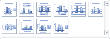
Chart layouts
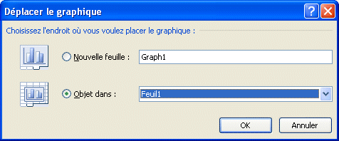
Move the chartYou can change at any time the location of a chart. You can the place it on a worksheet besides some values of your rapports or place it on a worksheet just for your chart.
Layout tab
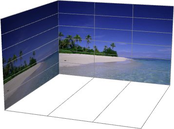
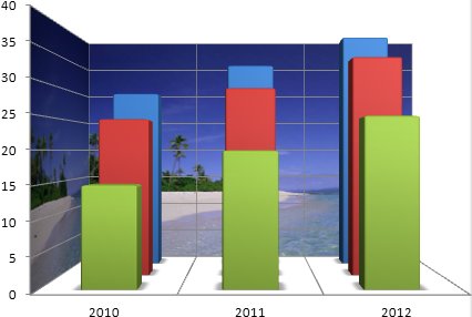
PictureYou can also insert a picture such as the company's logo or something that represents the content of the chart. It can also be used as the background for the chart or it can also be used to represent your data! There will be more explications on that last option with the fill option under the Format tab. |

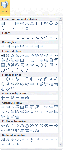
Shapes
Text BoxYou can also add text boxes to your chart to add some short explications to it.
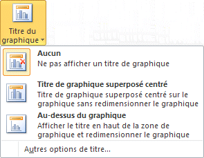
Afterward, you can change the shape text box and move it to the location of your choice. Chart title
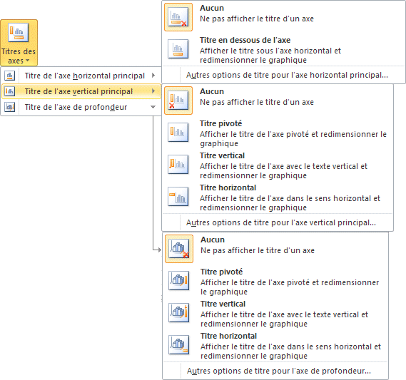
Axis titles
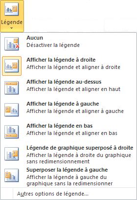
Legend
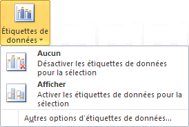
Data labels
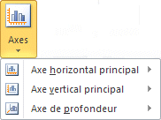
Data tableA data table shows the values represented in the chart in the form of ... a table that is located below the chart. This option in sonly useful is there are only a few numbers. It's useless if there are too much. Axes
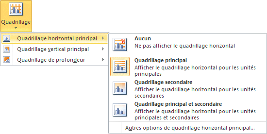
Gridlines
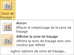
Plot area
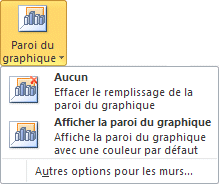
Chart wall
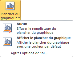
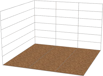
Chart floor
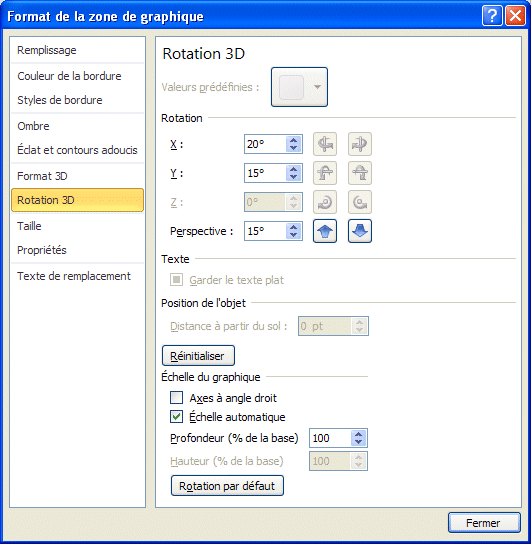
3-D Rotation
Trendline
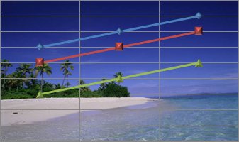
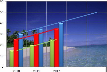
It's often hard to determine a trend from a mass of data. That is why a trendline helps bring out the results. Excel 2010 offers many types of trendlines. It could be linear, exponential, logarithmic, polynomial, power or a moving average. The chart above shows linear trend with the green line, an exponential trend with the red line, and a future linear trend with the blue line. Be aware that trendlines are only available for 2-D charts. Rows
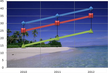
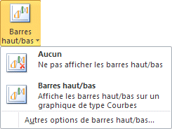
There are two types of rows: projection and Up/Down. They allow you to project a trend or to view the highest and lowest values. You can then view the range between the minimum and the maximum for each period. The chart above shows this type of line. This type of line is only available to line and stock charts. Up/Down Bar
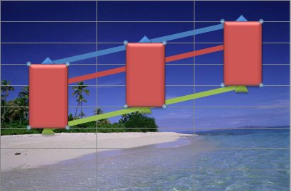
The up/down bars are another representation of the up/down rows mentioned previously. They allow you to view the lowest and highest values for every period. Error Bar
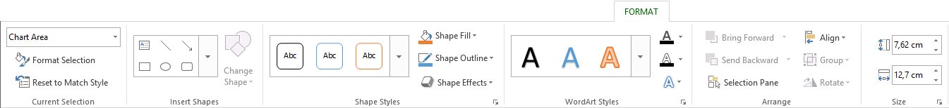
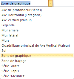
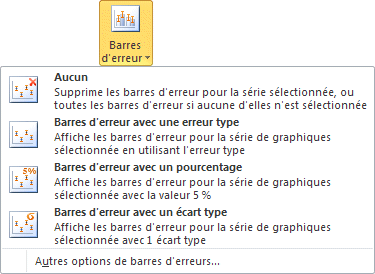
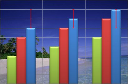
The error bars shows the margin of error according to some criteria. The Format tabThis tab allows you to change the presentation styles of each and every element that marks the chart. It's under this tab that you can improve your chart's presentation. With Excel 2010, you can double-click on an element to have a complete list of options to change the style. You can also select an element and press for the right mouse button and choose the option Format the selected item. List of elementsAs from Layout tab, this first option allows you to choose an element from a list of all the items that compose the chart. This is very useful when there are many elements close the each other. Format Selection
Reset to match styleYou can experiment as much as you like knowing that you can always reset your chart to its original options. Styles of format
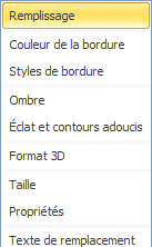
Shape fill
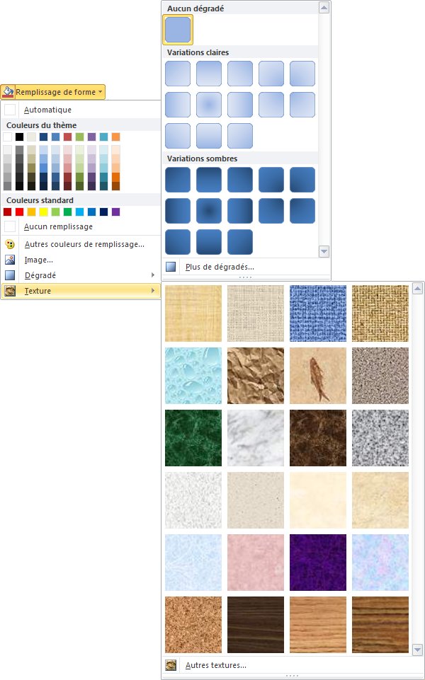
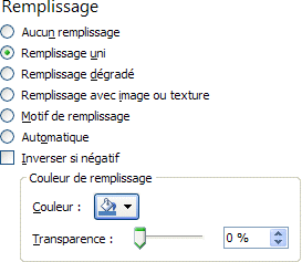
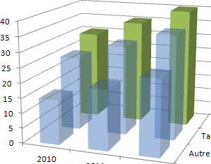
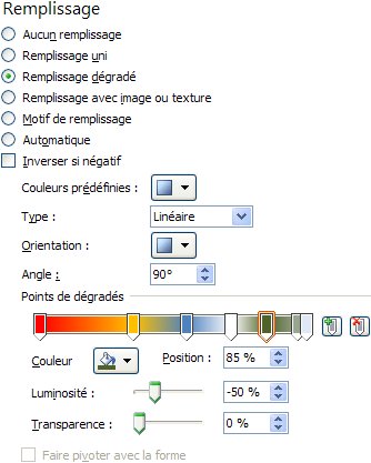
This option allows you to determine the background of the chart or any element that composes a data series, the color, the pattern, a gradient fill or a picture of your choice.
There are fill options for colors, gradient fill, picture or texture fill and pattern fill. You can select even more options once you have chosen a type of fill.
The transparency option allows you to remove the emphasis from some data series. Also, it allows you to view data that would be hidden otherwise.
The gradient fill can help place emphasis on a data series instead of the others. There are predetermined gradient fills or you can create you own. Use the Move the bars
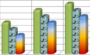
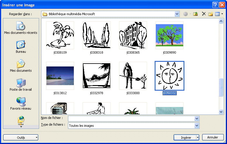
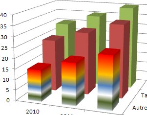
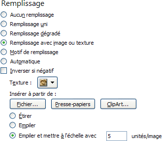
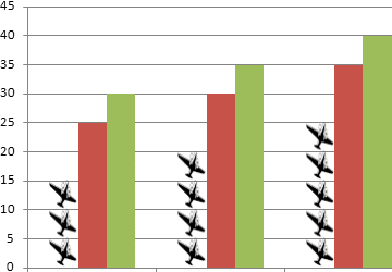
You can also insert a pictures to represent the data. It can be a clipart of the librairie of picture of Microsoft Office or another picture that répond aux needs.
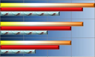
The chosen picture will be streched to cover the entire data point. That could be enough for your needs. But the stack options are also very interesting. They allow you to stack pictures one on top of the other as seen in the example above. In this case, a complete picture represents each value of 5 units. The first column has three pictures to represent 15. The 4 planes in the second column represents 20 units and 5 planes for 25 units. To have the best effect, you may have to remove the data series outline. Shape outline
Shape effect
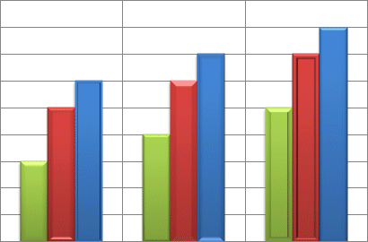
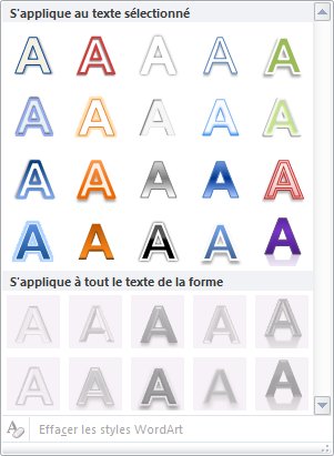
The shape effects places a style around a data series such as a shadow, a glow or a bevel on a shape. However, the most popular effect that Excel 2007 added is the bevel effect. The result is stunning. The chart above shows many effects with different types of bevel on every bar. Find the one that best represents your data. The 3-D rotation effect can only to applied to a few elements such as the entire chart or to shapes. WordArt Styles
Arrange
Size
|

| You like what you read?
Share it with your friends. |