Navigation Topics Tutorials Others Contact |
Excel - Pivot tablesIntroduction IntroductionExcel offers you a fascinating tool to create a synthesized view from a vast pool of data called a pivot table. As the name indicates, Excel generates a table that allows you to see the contents of one or several variables at the same time. Furthermore, the table is dynamic. It means that you can add, remove and change the location of elements in the table Excel will automatically give you a new view on your data. Note: The next exercise consists in creating a pivot table that offers the total of salaries according to gender and the type of work an employee occupies in the company. |
|
Before creating a table ...You need a database before being able to create an use a pivot table. It's possible to create and manage simple databases from Excel. There are certain terms that you should know before starting.
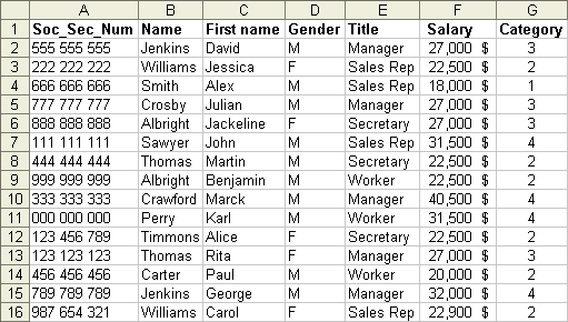
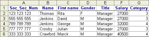
In an Excel database, every column represents a field. The name of the field should be on the first row. Every following row represents a record. So that Excel is capable of recognizing all the records that compose the database. It's important not to leave any empty rows. All the rows after the name of the fields must have records. The following database has some data on the employees of a company. You can write the data below in a worksheet copy an dopen the datalist.xls document thant you can also find in the demonstration files Web page.
Create a pivot table
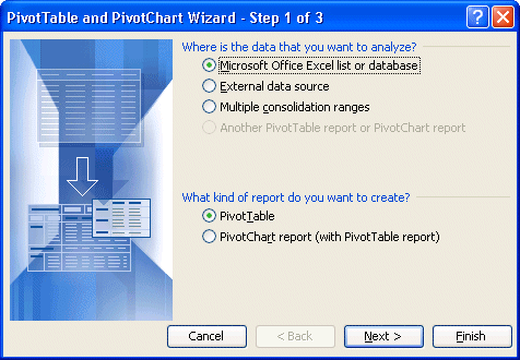
Excel asks you where the data required for creating the pivot table is located. The database can come from four different sources.
Excel will then asks you for the type of report that you want: a pivot table or a pivot chart? This version of Excel allows not only to generate a pivot table but also a pivot chart.
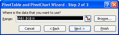
Excel asks you to confirm the place where the data that you need is located for the pivot table.
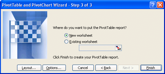
Excel will then ask you where you want to save the pivot table. Is it in a new worksheet or an existing worksheet?
You could press the End button and to begin to create the pivot table. But before we do that, let's see what other options are offered in this window.
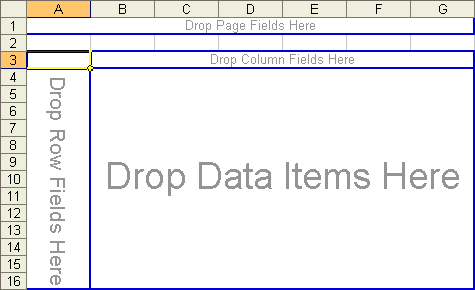
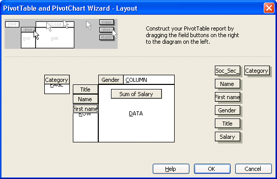
This window also allows you to create immediately a pivot table. You can place the fields that you need, located on the right, into four different areas: page, row, column and data.
This presentation of the a pivot table's layout was only to show you the different areas that compose a pivot table. We will not be using this window to create the pivot table. But you could use it when you will be creating you own PivotTables.
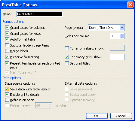
This window allows you to personalize how the data will be viewed in the pivot table. For example, you can decide to activate or not the sums for each row and column of the table. Furthermore, you can change these options at any time according to your needs.
Placing the fields in the tableExcel created a new worksheet with an empty pivot table "shell". The four areas that were before mentioned in the Layout window are all here: page, row, column and data. It's up to you to place the fields that you need in their proper areas and view the results.
There is also a toolbar for the pivot table that should appear next to it. If you don't see it, here's what you should do to see the toolbar.
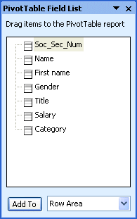
It's also possible that you don't see the list of the fields that composes the database. To view it, place the cursor anywhere inside the pivot table shell.
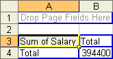
The table now indicates that the sum of all the salaries for the company is 394 400 $. The next step consists in distributing this by occupation within the company.
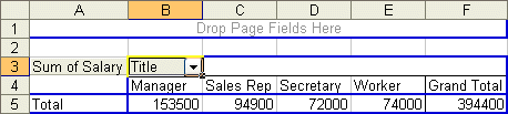
The new table shows the total of salaries by occupation (title: Manager, Worker...) with always a grand total of 394 400 $. The table shows each of the values of the Title field with the total of salaries for each. The next step consists in distributing the total of salaries by title and by gender.
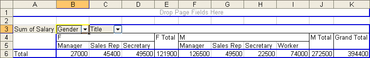
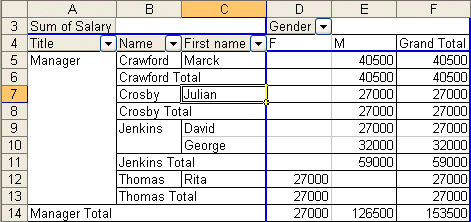
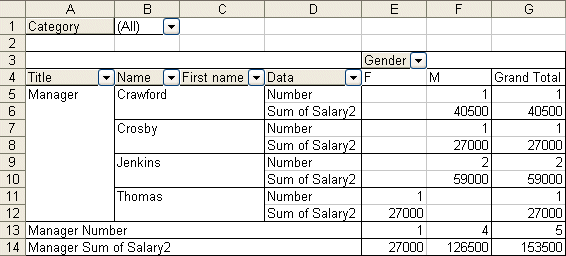
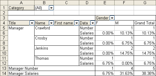
The Gender field will automatically be placed in front of theTitle field. Because of the length the table, only a part is shown on your screen. It's also possible to change the order of the fields in an area. The next step consists in giving the priority to the Gender field over the Title field.
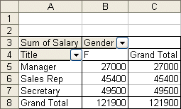
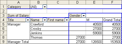
Here is the same data from the previous table but shown in a different way. The salaries totals for the female managers of the company is always 27 000 $ whereas the men have 126 500 $. However, the data is now grouped by occupation and then followed by gender. The next operation will show an easier way to understand the same data.
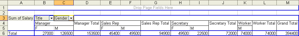
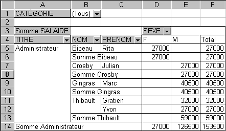
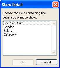
Although it's the same values than the previous tables, this view is much clearer to understand. A pivot table is dynamic. You may place a field in any of the four areas and the table will automatically regenerate with a newer, and hopefully, better view. View the underlying dataExcel allows you to see the records that compose the results of the table. The next step consists shows the records that are the total of the managers (153 500$).
A new worksheet will be created with the records and the data on the managers. You can redo the same thing for every cells of the pivot table.
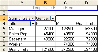
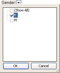
Filter the fieldsThe next operation will allow you to filter the values that you need. It consists in determining the salary total of only the women in the company. The pivot table allows you to mask or to hide the values that you don't need. For this case, you must hide the men.
The pivot table shows you a list of all the values that are in the records.
This new table shows the salaries total for all the women of the company. notice that the value " M " is not shown in the table.
But there is another way of filtering the data. It's by placing the field in the page area.
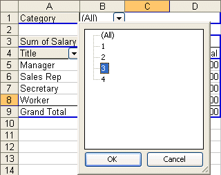
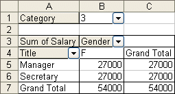
Because the Category field is in the page area, it's now possible to filter all the data of the table on that field. The next exercise consists in showing only the data from the employees that are in category 3.
Here is the table of the total of salaries for all the employees that are in category 3. This demonstrates that you may filter the records that compose the pivot table on the fields that compose it; whether it's placed in the row area, the column area or the page area.
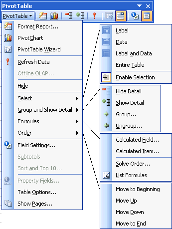
The Pivot toolbar's optionsThe pivot table's toolbar offers other options to change the pivot table's presentation. This next part describes you these options and how they work. You have below a combined picture with all the options from the pivot table.
Format Report option
|


| Sum | Show the sum all the values of this field. |
| Nbval | Show the number of records in this category. |
| Average | Show the average of all the values of this category. |
| Max | Show the highest value of the field. |
| Min | Show the smallest value of the field. |
| Product | Show the product of all the values of the field. |
| Count nums | Show the number of records in this category. |
| StdDev | Show the standard deviation of the field. |
| StdDevp | Show the standard deviation of a population. |
| Var | Show the variance of the field. |
| Varp | Show the variance of a population. |
The field parameters window also offers you other options such as demonstrated in the next part.
![]() Click
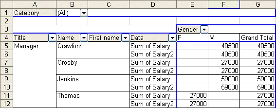
one of the boxes the Sum of SALARY2.
Click
one of the boxes the Sum of SALARY2.
![]() Press
the
Press
the ![]() button.
button.
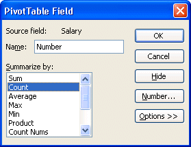
![]() Change
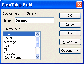
the name of the field Sum of SALAIRY2 to Salaries.
Change
the name of the field Sum of SALAIRY2 to Salaries.
![]() Press
the field Number button.
Press
the field Number button.
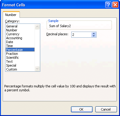
The Number option allows you to change the presentation of the values of the field. It's the same thing as the Number option under the Format, Cell and Number for a cell of your file. But it only affects a field instead of a cell.
![]() From
the list of the categories, select the Percentage option.
From
the list of the categories, select the Percentage option.
![]() Press the OK button.
Press the OK button.
![]() Press
the Options field.
Press
the Options field.
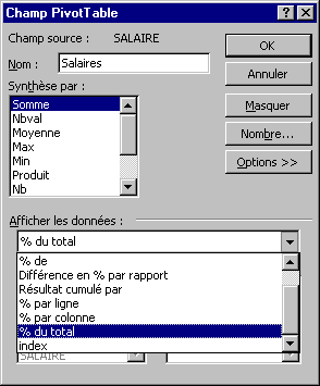
Another powerful element of the parameters of fields is that you may view the values compared to other fields or the total. In this case, we will show the value of field with regard to the total of salaries.
![]() Among
the types of views, select % of the total.
Among
the types of views, select % of the total.
![]() Press the OK button.
Press the OK button.
The table's presentation changes again to show the number of persons, by gender, as well as their percentage of salary with regard to the grand total of the salaries.
Group the values of fields
Not only can you summarize values by field, you can also group together the values of different fields. For example, you can group together the employees who are in the head office (managers and secretaries) of those that are " on the ground " (sales rep and worker). The next part consists exactly in creating these two groups.
![]() From the rows area, click in the cell where it's written Manager.
From the rows area, click in the cell where it's written Manager.
![]() While pressing on the CTRL key, click the cell where it's written Secretary.
While pressing on the CTRL key, click the cell where it's written Secretary.
The CTRL key allows you to select several values to be able to group them together.
![]() Press the right mouse button.
Press the right mouse button.
OR
![]() From the PivotTable toolbar, press PivotTable button.
From the PivotTable toolbar, press PivotTable button.
![]() Select the Group and Show Detail option, and Group.
Select the Group and Show Detail option, and Group.
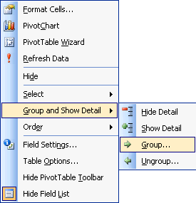
This context menu shows to you some of the options that you saw before. It's easier at times to use the right mouse button then to constantly return to the pivot table's toolbar. It's however necessary to master these options before being able to use them in this menu. There is however an option that's is not anywhere else; that's to group together the values of a field.
![]() From the context menu, select the Group and Show Detail option followed by Group.
From the context menu, select the Group and Show Detail option followed by Group.
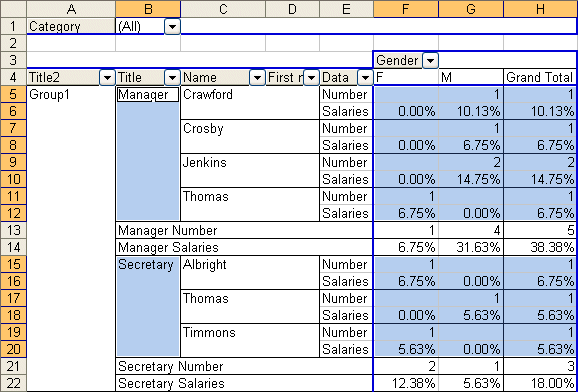
You'll notice that a new field added to the rows area that's called Title2. It only has a single value called Group1. It groups together all the values for managers and secretaries.
It's now time to group together the values worker and salesperson together.
![]() From
the rows area, click in the cell where it's written salesperson.
From
the rows area, click in the cell where it's written salesperson.
![]() While
pressing on the CTRL key, click in the cell where it's written Worker.
While
pressing on the CTRL key, click in the cell where it's written Worker.
![]() Press the right mouse button.
Press the right mouse button.
![]() From the context menu. select the Group and Show Detail option, followed by Group.
From the context menu. select the Group and Show Detail option, followed by Group.
There are now two groups: group1 and group2. The next part consists in improving the presentation of these groups just a little by changing the names of the field and the values.
Change the name of a value
You can change the content of a cell in the pivot table like you can do in any ohter cell in the worksheet.
![]() Place the cursor in the cell with the Group1 text.
Place the cursor in the cell with the Group1 text.
![]() Click
in the Formula box on top of the screen.
Click
in the Formula box on top of the screen.
![]() Change
the name to Office.
Change
the name to Office.
OR
![]() Press
the F2 key.
Press
the F2 key.
![]() Change
the name to Office.
Change
the name to Office.
![]() Place
the cursor in the cell Group2.
Place
the cursor in the cell Group2.
![]() Click
in the Formula box on top of the screen.
Click
in the Formula box on top of the screen.
![]() Change
the name Field.
Change
the name Field.
OR
![]() Press
the F2 key.
Press
the F2 key.
![]() Change
the name Field.
Change
the name Field.
All that remains is to change the name of the field Title2 to Location.
![]() Place
the cursor on the field Title2.
Place
the cursor on the field Title2.
![]() Press
the
Press
the ![]() button .
button .
![]() Change
the name of the field of Title2 to Location.
Change
the name of the field of Title2 to Location.
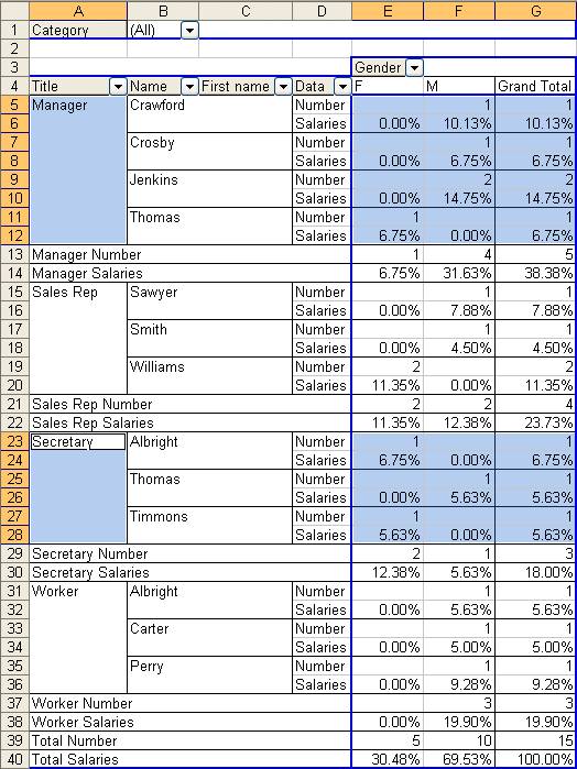
The employer at need of a synthesis that does not include fields Title, Name and First name. You could remove the useless fields. But we're simply going to mask them for the moment.
![]() Place
the cursor in the cell with the cell Office.
Place
the cursor in the cell with the cell Office.
![]() Press
the
Press
the ![]() button.
button.
![]() Place
the cursor in the cell with the text Field.
Place
the cursor in the cell with the text Field.
![]() Press
the
Press
the ![]() button.
button.
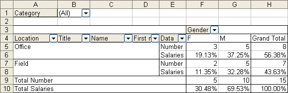
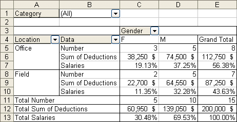
Here is an interesting table with several data represented in various ways. It shows the number of persons who work at the head office or on the field and the proportion of the salary compared to the grand totals. But there's even more.
Creating a calculated field
The pivot table allows to add calculated fields. This allows you to do operations on the data in the pivot table. Besides the data supplied in the last table, the employer would like to know in how much his contribution to different programs such as insurance and the pension plan costs the company. This contribution equals to 50 % of the salary of the employees. The next part consists in adding a calculated field that calculates this according to the salary of the employees.
![]() Place
the cursor on the pivot table.
Place
the cursor on the pivot table.
![]() From the pivot table toolbar, select the options Formula and Calculationated Field.
From the pivot table toolbar, select the options Formula and Calculationated Field.
OR
![]() Press the right mouse button.
Press the right mouse button.
![]() From the list of the options from the context menu, select the options Formula and Calculationated Field.
From the list of the options from the context menu, select the options Formula and Calculationated Field.
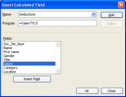
![]() In
the box Name, write Deductions.
In
the box Name, write Deductions.
![]() From the list of fields, click SALARY.
From the list of fields, click SALARY.
![]() Press the button Insert Field.
Press the button Insert Field.
![]() Click
in the Formula box.
Click
in the Formula box.
![]() Place
the cursor after =Salary.
Place
the cursor after =Salary.
![]() Add
to the formula *0.5.
Add
to the formula *0.5.
![]() Press the OK button.
Press the OK button.
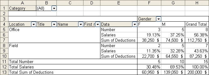
The employer now knows what its contribution is by category and the grand total. For your part, you now know how to add a calculated field in a pivot table.
Layout of the fields
The last table show the data wanted by the employer. However, you may improve the arrangement of fields. It's time to clean up the report before handing it over. The next part consists in placing the data on the contributions just after the number of persons by group and to remove from the row area the fields Title, Name and First name.
![]() Place
the cursor on the table.
Place
the cursor on the table.
![]() From
the PivotTable toolbar, select the PivotTable Wizard option.
From
the PivotTable toolbar, select the PivotTable Wizard option.
![]() Press
the Layout button.
Press
the Layout button.
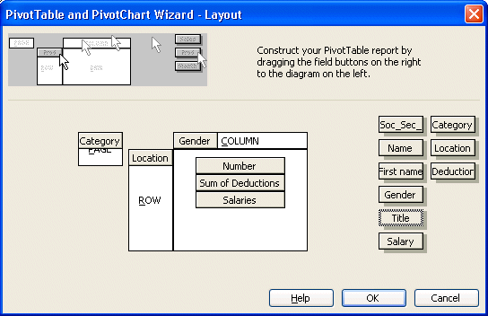
To remove fields
![]() Place the cursor on the Name field in the Row area.
Place the cursor on the Name field in the Row area.
![]() Remove the field by pressing and holding the left mouse button and move the field outside of the areas of the pivot table.
Remove the field by pressing and holding the left mouse button and move the field outside of the areas of the pivot table.
![]() Release the mouse button when the cursor is out of the table.
Release the mouse button when the cursor is out of the table.
![]() Repeat the operation for the First name and Title fields.
Repeat the operation for the First name and Title fields.
To change the order of the fields.
![]() Place
the cursor on the calculated field Sum of Deductions in the Data area.
Place
the cursor on the calculated field Sum of Deductions in the Data area.
![]() Press
and hold the left mouse button and move the field between Number and Salaries.
Press
and hold the left mouse button and move the field between Number and Salaries.
![]() Release
the mouse button when the field box is in the middle.
Release
the mouse button when the field box is in the middle.
![]() Press the OK button.
Press the OK button.
![]() Press the Finish button.
Press the Finish button.
As you're able to understand it after this page, the pivot table offers a multitude of options to represent a mass of data. You can now take advantage of all these options for your own needs. Enjoy!